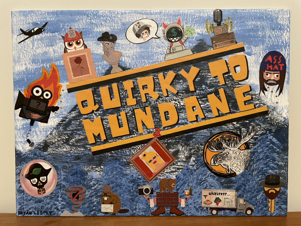
Acrylic, ink, and paper on canvas board
2024
A while ago I came across this old TV show from the 1990s called Northern Exposure. It’s about a New York City doctor who gets sent to work in a remote Alaskan town for four years to pay off his student loans from medical school. The doctor hates his situation but overtime he grows accustomed to his surroundings and the people in his life on the Alaskan frontier. I watched the entire 110 episode series and found the show to be rather entertaining, for the most part.
Unfortunately, the quality of the show started to decline in the fourth season and then went way downhill starting with the fifth season. For the first four seasons, the show was lighthearted and goofy with an evolving narrative but then it was replaced with a bunch of boring and disconnected stories that didn’t really have a point. The decline in the show was mostly caused by production issues behind the scenes but when a major casting changed occurred in the sixth and final season, it caused me to lose interest in the show entirely. I only watched the remaining episodes out of commitment.
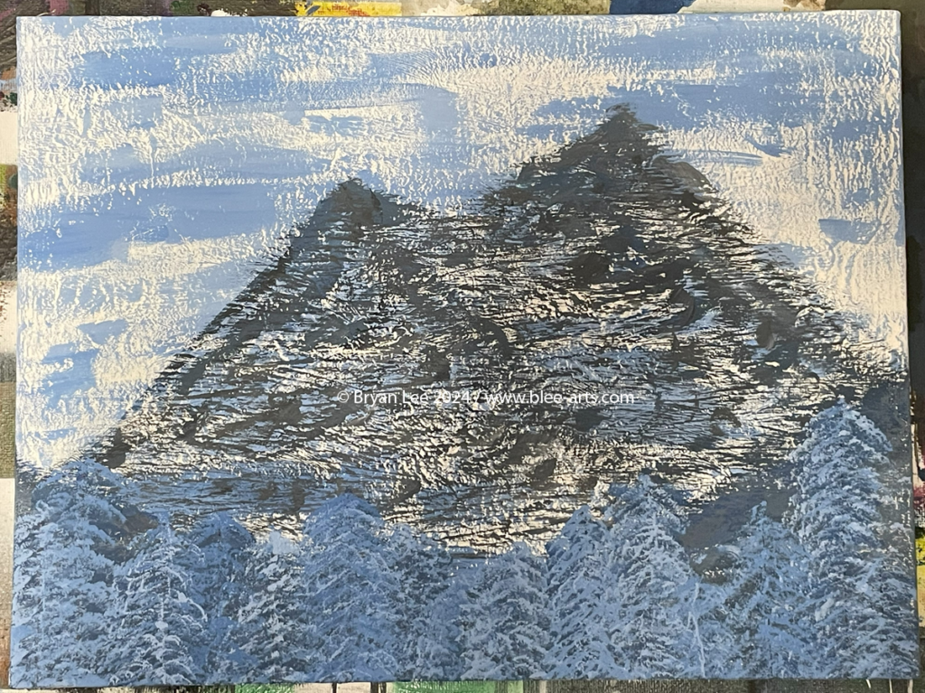
The canvas board that I used was recycled from another project. I painted over the surface with a thick layer of white matte acrylic paint. I’m not sure if I’m using the correct term, but I wanted the composition to mimic the “thumbnail” images that digital platforms are using to display the different seasons of the show on their websites – a mountain range in the background with the show’s title and logo in the foreground. I hastily brushed light blue matte acrylic paint across the whole surface to create the sky. I used a mix of dark blue and grey paint to make some triangular shapes that sort of look like mountains. I dabbed various shades of dark blue paint at the bottom of the board to create trees. I didn’t like how they turned into one big blue blob so I drew straight lines with a pen to mark the new tree positions and then used lighter shades of blue to recreate the trees.

This is the first time I’ve painted a landscape background in this style. I looked at a reference image while I worked but I’ve never tried or been taught to make a landscape like this before. Most of my previous work has been abstract and surrealist. I took pictures to document my progress but when I migrated the files from my camera to my computer, something went wrong and the photos were overwritten with duplicate files of other photos on my memory card. I don’t know what caused this but I lost all of the photos except this one.
I used a free web-based graphic design program to try and create stylized text that sort of looked like the font they used for the show. I couldn’t find anything similar so I just picked a blocky font and added some drop shadows for additional effects. I printed out the text and cut out each piece by hand. I also used a variety of images to try and recreate the “logo” – a silhouette of a moose over a tree ring. My version isn’t exact but it gets the point across. I printed this out and once all the pieces were cut, I glued everything to the board with a glue stick to hold them in place. Then I used matte mod podge and coated the entire surface so that the paper pieces wouldn’t peel off the board. I was worried about this part because the last time I did something like this for another project, the mod podge saturated the paper and distorted the colors of the images I had printed out. I tested it on a scrap canvas board with the same paint and a few duplicate images but it didn’t seem like the mod podge affected the paper’s color quality. (I took a photo of this but it was among the photos lost in the data transfer)
A few pieces of paper lifted off the canvas so I had to squash them down with more mod podge but that caused wrinkles and creases in some places. I also put the first “N” in mundane upside down on accident and didn’t notice until after the mod podge had dried. I think these imperfections add to the chaotic nature that my art piece would eventually encompass.
I was going to stop here but my canvas had a lot of empty space so I decided to create composite images that represented each of the main characters and a lot of the side characters from the show. I used the same graphic design program and for each character, I picked several images that are mostly related to their physical attributes, personality traits, professions, and place of origin, among others. I combined the images to make clever references to a particular character (or at least, I think they’re clever). Anyone who has watched the show could probably figure out which images are assigned to each character. Some of the images are rather simple compared to others and I didn’t put as much effort into them because I didn’t really care for certain characters as much as others. I’m not going to explain the images for the characters so if you care to find out more, you can watch the show for yourself.
I didn’t notice this until after I had glued down all of the images, but some of them were kind of blurry compared to others. It’s hard to see unless you’re looking really closely. I used the same printer to print all the images so I didn’t think it was an issue with the settings, but then I realized that I printed the images in two different batches with different file configurations. For the first set, I downloaded the files as .PNG and then sent them directly to my printer. For the second set, I downloaded the files as .PDF and then printed them. The images in the .PDF files look a lot cleaner.
Previous / Next
